ince we've launched Wallery, we have been listening to your feedback and improving steadily. With a sleeve of new changes ready for their final testing, we wanted to give you a preview of what is to come.
New Wallery is full of significant improvements. From what we consider to be the best social media wall creation process to our powerful Wallery Designer – which was reimagined based on your valuable feedback!
This article is not an attempt to list all the changes and improvements we’ve made – it is merely a preview of the most visible ones and intends to give you an understanding of the extent of those changes.
I am immensely proud of my team. From the launch and every day after it – they have been (re)thinking, (re)imagining and improving what we have built.
Making great products takes a lot of time, effort and passion. Managing that entire process has been a significant challenge for us. This was the first product we’ve ever built and released in the form of omnipresent SaaS, after all.
While I have many stories and lessons learned that I would like to share, they are better suited for another blog post. Today, it is all about the new and improved Wallery – and making sure we make it into world’s best social media wall and social media hub solution.
Dashboard: New social media walls done easier
At first glance, you will notice we’ve moved the “+” sign from the right edge of the screen, and positioned it within the central area where walls and hubs are being created.
We felt that by making this design change we will better reinforce and describe its function. Throughout our usability studies and user interviews, we learned that some users had trouble recognising the circular “+” sign. They struggled even to start the process of creating their first social media wall or a hub.
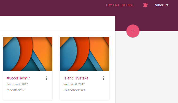
Now, with Add icon positioned exactly where the key action is being performed, users don’t waste their valuable time looking for the hub creation button. They are ready to create their first social media wall in seconds!
Truth be told, I insisted on keeping the “+” sign at its initial position.
I believed users will understand it immediately since it was a pattern we have taken from Google’s own Material Design and their guidelines. I didn’t even bother to test it. The key lesson here: Just because Google/Facebook is doing something in a certain way it doesn’t mean that it will work for you. Just test it. Trust the users, not guts. Or guidelines.
Hub and wall operations
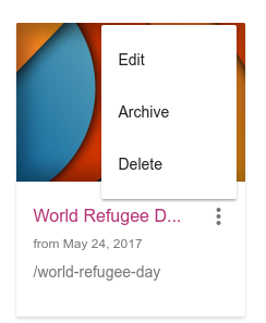
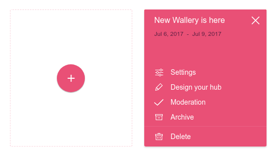
In the further attempt to distance ourselves from MD patterns that didn’t perform well, we reimagined contextual actions on hub cards. Previously, you would click on an overflow button (“those three dots”) and a popup menu would appear. And that worked fine, but it did introduce several challenges.
To solve those challenges, we expanded further on the “card” metaphor.
Now when you click “those three dots” you get a beautiful, large and more informative selection of options. Those will not disappear if you accidentally move your mouse or click somewhere else. They are there, persistent and more intuitive.
Of course, they will go away when you select an option or dismiss them by clicking on an “X” in the top right corner.
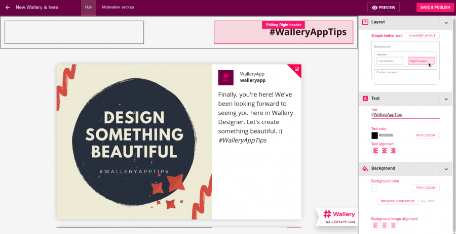
Wallery Designer – creating your best social media wall
Wallery Designer is a crucial component of Wallery. It enables you to create social media walls or hubs and allows you to customize them.
You can select some of the predefined styles and templates, but why stop there? With Wallery, you can create an entirely new and unique style by uploading your logo, a background image and more. Of course, this is the place where you define social media networks and types of content you would like to gather from them.
Significant challenges we addressed, compared with the first version, is the ease of use and the ability to quickly grasp the concepts.
With that in mind, we introduced set of predefined pieces of content (“dummy content”). They will give you an immediate information about how your social media wall or a hub will look like –
even before you have defined your hashtags and content sources!
Each piece of content comes with helpful tips and guides you towards making sure you can create a great social media wall experience.
Additionally, we redesigned the sidebar and made it more streamlined and easier to use. However, our most significant improvement is at the top of the sidebar.
Enter Design Inspector tool. It is a useful tool that lets you select different parts of your wall and edit them. You can still just point and click on the main designer surface and make the edits, but now there is a handy way of doing it using our Design Inspector tool.
To all web developers reading this – yes, this is heavily inspired by Google’s and others Dev Tools.
Give us a release date!
We are now in the final stages of testing the product and optimizing some under-the-hood improvements. We want our next release to be a significant improvement, not just from the user interface and user experience point of view, but rather from the performance and engineering perspectives.
After the summer, we will be ready to roll-out our changes and share with you the new and improved Wallery. This will bring it closer to fulfilling our ambition of making the world’s best social media wall and social hub solution!
Of course, we will keep you posted!